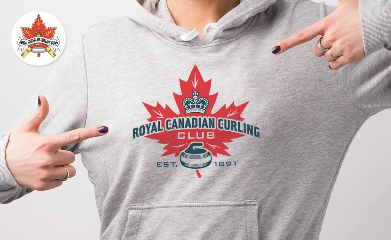
A Historic Crest Gets a Refresh!
The Royal Canadian Curling Club has a rich and storied history that dates back more than a century in downtown Toronto. As a long time member, I always felt that the original crest could use a refresh. I couldn’t help notice that the ribbon containing the club’s name was very hard to read. This was particularly obvious when viewed at small sizes. When the time came for the club to embark on a branded merchandise program, it became very apparent that the old crest would prove problematic.
I decided to take on the re- design. My vision was to modernize and simplify the logo, but still retain much of the design elements that were familiar in the original crest. I also tried to instill a bit of classic “Canadiana” in it’s look and feel. My previous experience as a clothing designer, taught me that this classic retro look would prove more desirable for merchandise purposes.
I presented my design to the club’s Board of Directors. It was warmly received.
The result? The club has taken the new crest to heart as it’s now being utilized in various on-ice branding and signage applications. Also a successful merchandise program was launched in the fall of 2020.


5 replies on “A Historic Crest Gets a Refresh!”
Paz Abela
Way cool! Some extremely valid points! I appreciate you penning this article plus the rest of the website is also really good.
wpadmin
Thanks for the positive feedback Paz. I hope you come back again.
graliontorile
Neat blog! Is your theme custom made or did you download it from somewhere? A design like yours with a few simple adjustements would really make my blog shine. Please let me know where you got your theme. Appreciate it
wpadmin
Thanks for your message. The theme is called Ozark. You can purchase it from Theme Forest. Best of Luck!
ogloszenie
It’s difficult to find well-informed people in this
particular subject, but you seem like you know what you’re talking about!
Thanks
Comments are closed!